Pokémon Go: Rebuilding Lost Community


The Challenge
For this project, I was tasked with identifying a current user problem for an existing digital product, and designing a new feature to improve users' experience. A lifelong fan of the Pokémon franchise, I decided to tackle the popular mobile game, Pokémon Go.
Since the MVP launch in the summer of 2016, the game developer, Niantic, has been routinely releasing updates resulting in an already feature-rich game. With this in mind, I expected a greater challenge in determining where else there could be value to users.
Research
To get started, I drafted a plan to guide my research and ground the project with specific assumptions, goals, methodologies, and a timeline.
Secondary Research
The first part of my research involved reviewing content from reputable, statistical organizations as well as both the Pokémon Company and Niantic themselves. Below are a few key findings:

1
Yearly revenue generated from the app has fallen from a 2020 high of $918,780,000 each of the past three years.
3
Central tenets of Niantic's mission are to:
-
Draw People Outdoors
-
Inspire Exploration
-
Create Connection
-
Encourage Exercise
This posed the question:
Would the further enhancement of this collaborative tool in Pokémon Go encourage more usage and thereby more user spending on the game? If not, what was the Campfire app missing?
Determining the Right Demographic
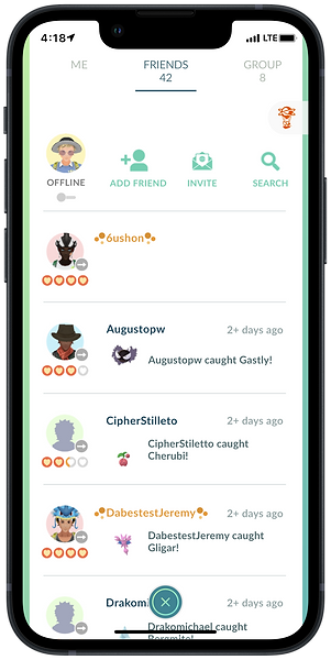
To identify the best users to interview, I decided to survey those with a presence on facebook. I accessed Facebook Groups like "Pokémon Go: Community" and "Team Valor" to connect with existing players who would likely have input into what the game was missing. Below is the survey that garnered 23 responses from current and past players.

87%
of respondents described their playstyle between average and very casual usage.
78.2%
of respondents described their hometown as either suburban or rual.
8.7%
of respondents play Pokémon Go to make new friends.
17.4%
of respondents used the Campfire App.
Getting to Know Real-Life Users
After confirming separate appointments with each of my six, targeted users, I held 30-40 minute one-on-one interviews with them. Our conversations were somewhat fluid, but I used the below interview discussion guide to steward each meeting. Using an audio trancription tool, I recorded notes in a spreadsheet to later use in anaylisis. The raw results are also below:
Define
Now with my data in FigJam; I began affinity mapping. My conversations with each user had touched on numerous topics with respect to the game, and I understood at this point the project may very well evolve away from the Campfire App. This was perfectly okay, as my original goal from my Research Guide was to improve cooperative play therefore improving player experiences.
Uncovering Insights
My focus on affinity mapping was keeping an open mind to the numerous insights uncovered from my research thus far instead of pigeon-holing myself into designing something that I, personally, wanted. Below is an exanmple of an insight (contained in the black rectangle) I had uncovered from grouping several users' comments. The full Affinity Map can be viewed below as well:

Narrowing the Focus
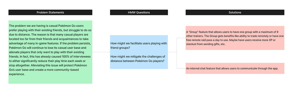
From my findings, I saw several patterns and identified a few of the key problems. I then generated "How Might We" questions for each and brainstormed solutions. Most notably, I learned that users wanted to play with their existing friends - not necessarily make new ones. Now this presented an entirely new problem: with friends far away and meetups infrequent, casual users had little reason to play the game since remote play with friends is difficult, especially for lower level players. Given all 6 inteviewees expressed this problem, I honed in on this issue.
Upon brainstorming and discussing with other designers in my network for additional feedback, I determined adding the "Group" feature mentioned below would be the most feasible from a development perspective and most beneficial to users.
Design
I was excited to take the next step and start mapping what, specifically, the feature would entail as well as how trainers would logically utilize it.
I realized this concept of a "Group" came with challenges. How would users be added or removed? What benefits would they receive? How do we protect Niantic's Mission of encouraging real-world play and meeting new people?
After ideating on several aspects for the feature, I negotiated between enticing casual players to play with their friends more and interact with others rather than play alone while limiting the group rewards such that the in-person, real world community aspect is protected. If power users could take advantage of the group feature and reduce the in-person time spent on the game they'd do otherwise, this feature would be a net negative for the Pokémon Go community as a whole.
The below points outlined my initial parameters and helped guide me to begin looking at process flows.
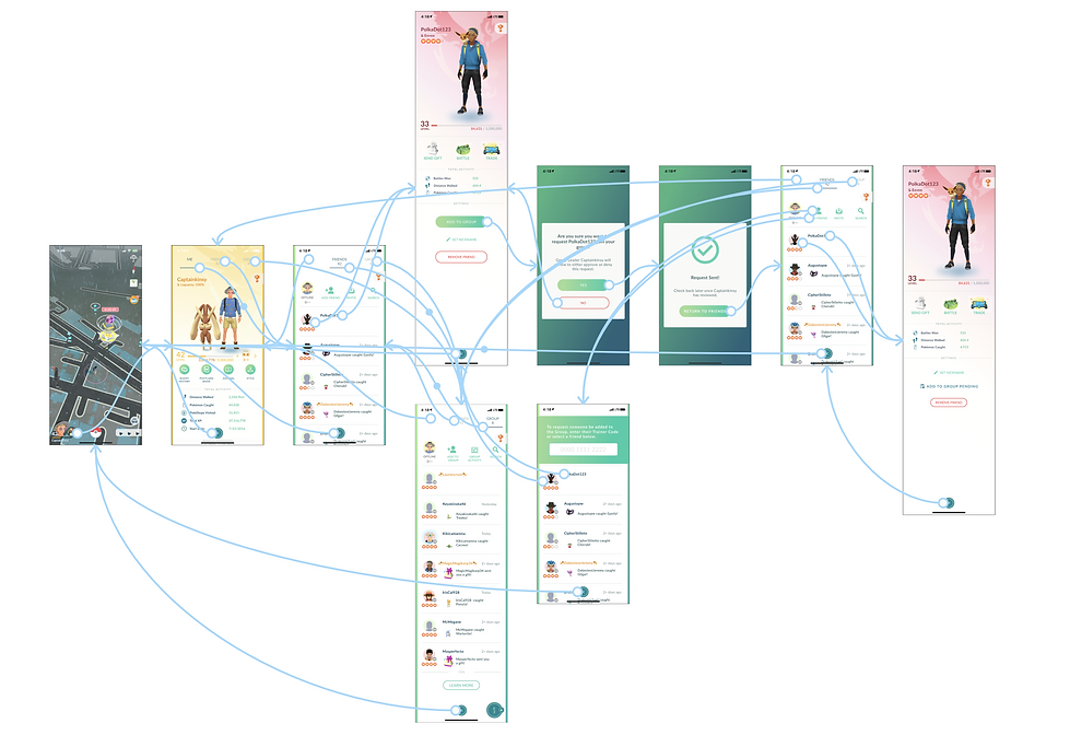
Thinking About the Process
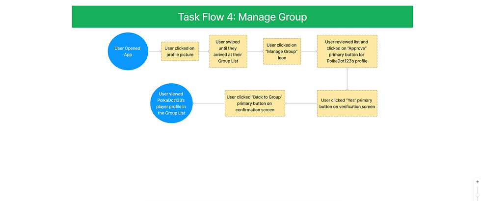
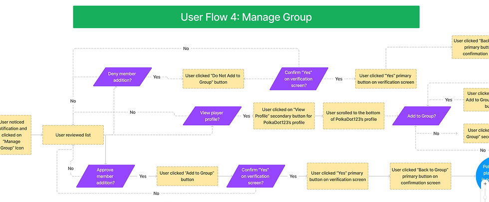
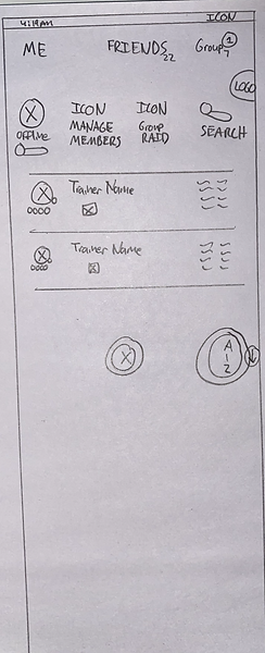
I created Task Flows and User Flows for the key screen designs I would be focusing on for this project. Below are examples for the Group Leader to "Manage the Group" but the others can be reviewed by following the link.
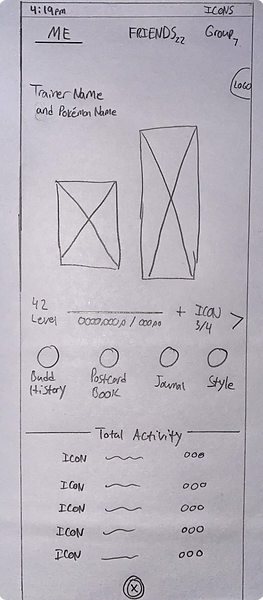
Sketching the Solution
With preliminary flows all set, I sketeched key screens to get a feel for how the feature would change the existing UI. The low-fidelity drafts helped me visualize multiple options quickly and without wasting time on any particular thought.
Profile Screens
The first concept I needed to visualize was the Group Page - that is, where users can see and interact with those trainers in their group. I focused heavily on learnability and limiting disruption for users when the feature ships by building on the existing content switcher pattern in the app's profile page. This change would be cosmetically minor and intuitive for users to quickly, easily find their group and limiting the adjustment period.
Existing Product
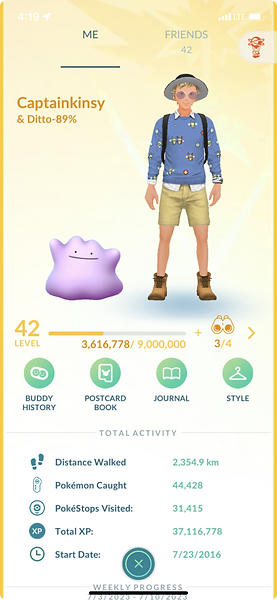
Sketch with Feature Added
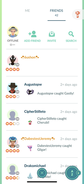
The "Group" Tab was added to the existing, top content switcher on the profile page. The concept of swiping right on your profile to view Friends is already common knowledge, so this was an intuitive way to incorporate the Group List.
Existing Product

Sketch with Feature Added
Users can continue swiping right from their Friend's list to access their Group List.
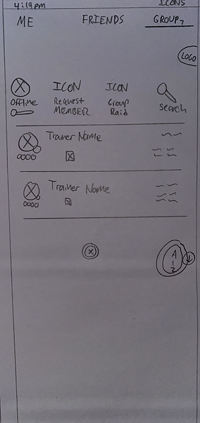
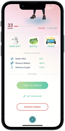
Add to Group
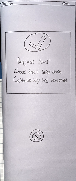
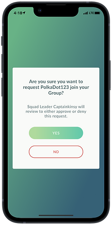
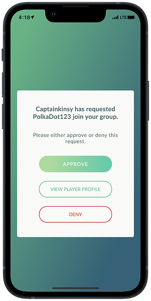
Naturally, we next had to deal with adding or removing a user from a Group. As previoulsy mentioned, the Group Leader was intended to either approve or deny acceptance to the group. Any group member could request another user be added to their group and a notification would be sent to the Group Leader to review.
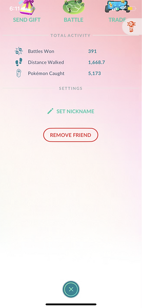
I decided to add an option on users' friends' profile pages. Currently, the app has a button to remove an existing friend from your friend list. The intention here is to add a similar action in the same place - either requesting to add a current Friend to a Group or requesting a current Group Member be removed from the existing Group.
Existing Product
Sketch with Feature Added


A normal Group Member (Not the Group Leader) will be able request another user be added to the Group so long that there are not yet 10 Group Members.
Manage Group
So now that users can request changes to the Group Members -
how does that review happen and what does it look like?
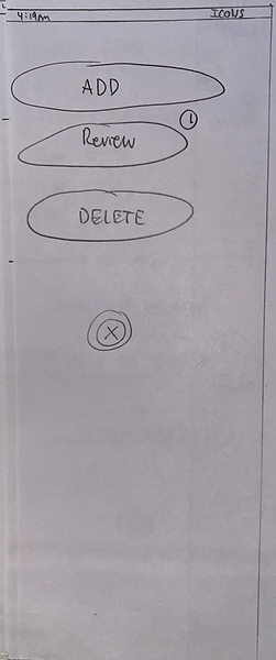
That's an excellent question, and I began sketching to visualize this. As previoulsy mentioned, the Group Leader was intended to either approve or deny acceptance to the group. Any group member could request another user be added to their group and a notification would be sent to the Group Leader to review.
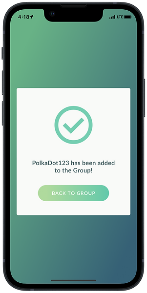
With that being said, the Group Leader's view in the Group Tab would be slightly different than a normal group Member's view - mainly with the "Manage Group" ICON. When the Group Leader clicks on the ICON from within the Group tab, they will be presented with a list of requested personnel changes (assuming there is at least one notification). From there, the Group Leader can either approve or deny the request or view their profile first before deciding. This allows for minimal changes/differences to the users' interface while still giving them the control they need right from the Group Tab.
Existing Product
Sketch with Feature Added
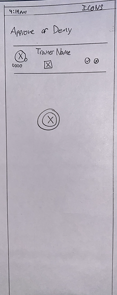
The Group Leader can approve or deny the requests from this menu or even click "Review" to see the player's profile before making a decision.
Getting Digital
With many of my key screens flushed out, it was time to start working on higher fidelity mockups to bring the concept to life. I used screenshots from the app to quickly represent the existing UI, but created the new components and those existing I would need to use for prototyping down the line. Taking measurements and color samples from screenshots, I was able to recreate the elements I needed to in order to add the feature in seamlessly.
Group Tab added to Profile Screen

After speaking with other designers in my cohort, it was suggested that including an additional process to add or remove users from the Group from within the Group List would be quicker and intuitive for users. I agreed with the suggestion and allocated an ICON space to an "Add to Group" button. This would allow users to either enter a Trainer code to add another user to the Group, or select a friend from their existing friend's list. You can see the ICON on the screen below:
Request to Add User to Group


Group Raid Request
From my research, Raid battles emerged as an important pain point for users. From those surveyed, 78.2% of respondents reported usually using friends to help win raid battles when completing them. Of this group, about 65% reported a strategic advantage with help from friends and one third described friend help to win these Raid battles as a necessity. With that being said, enabling collaboration for Raid battles with existing friends (albeit, with a reasonable limit) would make this aspect of the game more successful, more enjoyable, and would bring more people together through Pokémon Go.
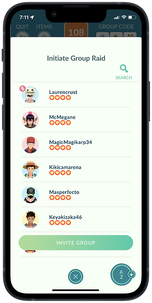

Users can invite their group to participate in one raid battle each day.
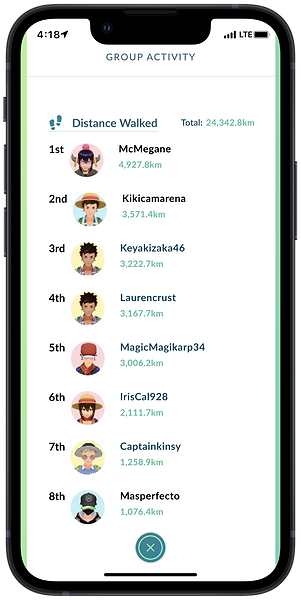
Group Activity
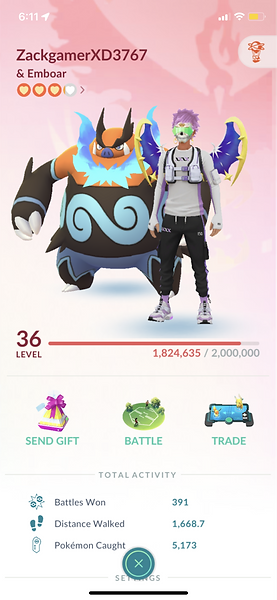
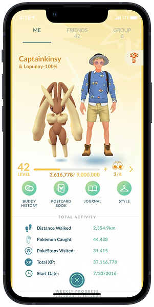
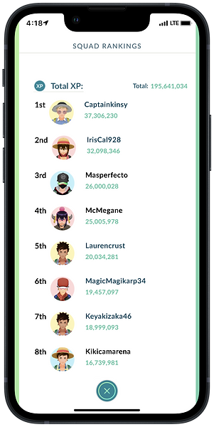
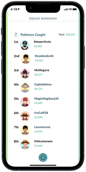
During interviews, 50% of participants described a competitive feeling toward their friends in terms of catching cool Pokémon, leveling up, or filling out their Pokédex. This sparked an idea where users could compare themselves to their Group members to facilitate a healthy, friendly rivalry. This would further encourage users to play the game since they can track their progress in several metrics against their friends. Below is an example of Group Members being compared in terms of their walking distance:
Testing
Now that my hi-fidelity screens were ready, I needed to get them in front of real users to test. I created a prototype to test five different process flows:
-
Check Group Activity
-
Initiate a Group Raid
-
Request a User be Added to a Group
-
Request a User be Removed from a Group
-
An A/B Test for the Group Leader to "Manage" the Group
Below is an example of the "Add to Group" user fow prototype:
Letting Users Guide My Decisions
For the "Manage Group" user flow - I was torn when creating my hi-fidelity designs. I asked myself:
Do I create something more visually pleasing and something I think may be more intuitive, or do I try to mirror the existing patterns that are already in the app's design?
In this case, I decided to ask the users themselves and conduct an A/B Test for these screens during the testing phase of the project. The two different option screens result from the Group Leader clicking the "Manage Group" ICON in the Group Tab. The resulting screen is either of the two below, and I had users test both:
Option A
Option B
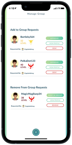

Through testing, I found 100% of participants preferred Option B, stating the UI was more visually pleasing to look at/interact with and they appreciated the extra information they could see at a glance as opposed to option A. With that feedback, it was clear I would proceed with Option B for the final design on that screen.
I recorded all the feedback from User Testing and similarly uploaded my notes to FigJam to synthesize. Being this project is intended as a change in an agile, sprint environment, it wouldn't be feasible to make every change recommended or identified during user testing. I created a diagram to rank each change's impact to end users and the effort it would take to complete before the project deadline. This helped me prioritize which improvements to focus on. Below is a snapshot of the high impact, low effort changes that were the first to be worked on.

Final Designs
We Need to Specify!
The first important changes were both very low effort, but high impact: changing the names of the feature itself. The term "Group" was already used in the app (albeit for a comparatively obscure feature) but due to 100% of users expressing confusion on this during testing, it was clear the feature for this project needed an exclusive name. I determined "Squad" actually fit better with the friendly, yet competitive connotation of this feature and wasn't used anywhere else in the app.
For the Group Activity flow, 3 out of 4 users experienced trouble understanding what this tab represented. Those users epressed that "Activity" sounds different than what information is housed there: ranking members by different metrics. I updated the name to reflect just that: Squad Rankings.
Squad Tab

Squad Rankings


Saving Space
During my observations as users were testing the prototypes, I noticed the original design of the content switcher resulted in wasted space at the top of the interface. Originally, this component was stretched across the entire width of the screen, causing the rest of the elements to be pushed further down the screen. Although relatively subtle, the more users can make use of their screen space, the less scrolling, less cognitive load, and ultimately, better user experience.
Before

After
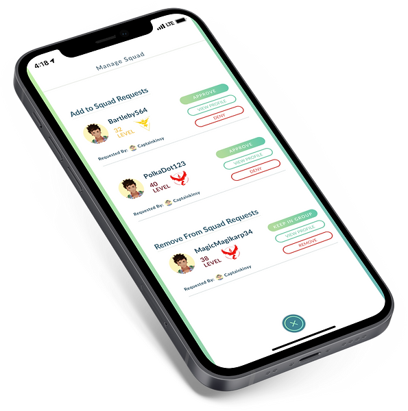
Final Iteration of Manage Squad Screen

Future Considerations
If time had allowed, there are further changes and additions I would make to the app/feature that fell out of scope for this project. Ideally, these would be addressed/targeted in a future update:
-
Potential to remove users from "Squad" from within the "Squad List" by swiping right on each player's profile to reveal a red "Remove" button.
-
In-app chat feature to replace Campfire or other communication methods
-
Global competitions that can be completed by Squads - Users work together to accomplish certain tasks
-
Global Challenges/Leaderboards to compete against other squads worldwide
-
Error Messages - Trying to Add a member to your Group if there's already 10 people and trying to do 2 or more Group Raids in one day